Most people open Claude Code and start prompting immediately. That's the wrong move.
Claude Code is good at building things. What it needs is context. Give it nothing and it fills the gaps with whatever the most common output looks like, and that's where the slop comes from.
This guide walks through the full process with Ascent, an imaginary AI growth agency I built from scratch using Claude Code. Brief, competitor research, brand identity, design system, full copy, custom imagery, deployment. Every step has a prompt or template you can use on your own project.
By the end, Ascent is live on a real domain. The same process can work for your business or your project too.
What you need
Set up accounts on Claude Code,
GitHub,
Vercel, and
Figma before you start. Two more show up mid-build but need no setup now:
Nano Banana for logo directions and
GPT Image 2 for custom imagery.
Before step 1, connect both GitHub and Vercel to Claude Code in settings. GitHub is how Claude reads your repo and pushes code. The Vercel connection makes step 11 a single command instead of a manual process.
1. Create your repository
Create a repository on GitHub and connect it to Claude Code. Everything from here lives inside it: the brief, the design system, the code. Vercel deploys directly from it.
2. Write down what you're building
Before any code, before any design, write a one-pager. This file becomes the source of truth for every agent you work with. The more specific you are, the less drift you correct later. Name it BRIEF.md, put it at the root of your repository, and reference it in every significant prompt you write.
# [Business Name] Project Brief

## What it is
[One to two sentences: what you do and who you serve. Be specific about the
service type, the customer, and the outcome you deliver.]

## What it isn't
[Three to four things you are not. Clarifies scope and filters out misfits
before they book a call.]

## Brand purpose
[One sentence: the deeper reason this business exists beyond making money.]

## Value proposition
[One sentence: what you offer, to whom, and what makes it different.]

## Who it's for
- [Customer type 1: describe by role, stage, or situation]
- [Customer type 2]
- [Customer type 3]

## The core problem we solve
[One to two paragraphs: the status quo problem, why existing solutions fall
short, and where you fit differently. Be specific: name the pattern you're
replacing, not just the pain point.]

## What makes us different
[Three to five concrete differentiators. Avoid vague claims. Name the specific
thing: the model, the method, the constraint you apply, the thing you refuse
to do.]

## Tone of voice
[Describe the brand voice in concrete terms: what it sounds like, what register
it uses, what it does not sound like. Include one example sentence that captures
it.]

## Business model
- [Offer 1: name and one-line description]
- [Offer 2]
- [Offer 3]

## Website objectives
1. [Objective 1]
2. [Objective 2]
3. [Objective 3]
4. [Objective 4]

## Primary calls to action
- [Primary CTA: one or two words]
- [Secondary CTA: one or two words]
- [Tertiary CTA: one or two words]
Here is the filled-in version I wrote for Ascent. Use it as a reference for how specific each section should get.
# Ascent Project Brief

## What it is
An AI growth agency for startups and scale-ups. We help founders and growth
leads find the conditions for compounding growth: the right channels, the right
signals, the right timing. We use AI to surface what human instinct misses and
move faster than traditional agencies can.

## What it isn't
Not a full-service marketing agency. Not a paid ads shop. Not a retainer-heavy
consultancy that bills hours and ships decks. Not for businesses that want slow,
committee-driven campaigns.

## Brand purpose
Growth that compounds. Every decision we make should make the next decision
easier and the next result larger.

## Value proposition
AI-native growth for companies ready to move.

## Who it's for
- Founders at Series A and B who have product-market fit and need to scale
- Growth leads at ambitious startups who want AI in their stack, not as a
  gimmick but as actual infrastructure
- Companies that have hit a ceiling with traditional agencies and need a
  different approach

## The core problem we solve
Most growth agencies are AI-augmented at best: they use the same playbooks
they always have and add a few AI tools on top. Ascent is built differently.
We start with data and signals, build the strategy around what we find, and
use AI to execute at a speed and precision traditional teams can't match.

## What makes us different
We don't take on clients we can't grow. We work in focused sprints, not
open-ended retainers. Every engagement starts with a signal audit: we find
where your growth is actually coming from before we touch anything. And we
measure everything, publicly, with our clients.

## Tone of voice
Direct. Precise. No agency speak, no buzzwords, no vague promises. Talks like
a founder who has done this before, not a vendor trying to win a pitch. Short
sentences. Specific claims. If we can't back a statement with a number or an
example, we don't make it.

## Business model
- Growth sprints: focused 8-week engagements with defined outcomes
- Signal audits: standalone diagnostic for companies not ready for a full sprint
- Retainer partnerships: ongoing work for clients post-sprint

## Website objectives
1. Qualify inbound leads before they book a call
2. Establish credibility through specific results, not vague case studies
3. Make the process clear so the right clients self-select
4. Convert visitors to booked calls

## Primary calls to action
- Book
- Our Work
- The Audit
3. Research your competition
Run this prompt in Claude deep research or
Manus. I've used both; output quality is similar for this kind of task.
You're looking for how competitors position themselves, what language they use, and where the gaps are. This feeds your positioning, your copy, and your brand direction. The prompt below gives you ten output sections covering individual competitor profiles, a positioning brief, a visual direction brief, a website blueprint, and a content strategy starter. Fill in every bracketed placeholder before running it.
# Competitor Research & Analysis: [Your Business Name]

## 1. Objective

Conduct a thorough competitor research and analysis to inform [Your Business Name]'s
brand positioning, service framing, pricing communication, website structure,
and content strategy.

The goal is not just to understand what competitors do, but to identify where they
fall short, what territory is unclaimed, and where [Your Business Name] can establish
a clear, defensible position in the market.

---

## 2. About [Your Business Name]

If you have a BRIEF.md, read it now for full context. If not, fill in the
following before continuing:

[Your Business Name] is [one sentence: what you do and who you serve].

Key differentiators to keep in mind when evaluating competitors:
- [What makes your service or delivery model distinctive]
- [What makes your commercial or fee model distinctive, if relevant]
- [Any service combination or offer that is rare in your market]

---

## 3. Competitor Discovery

Do not rely on a pre-supplied list. Identify competitors by searching using the
following approaches:

Search queries to use:
- "[your service type] agency [your geography]"
- "[your target customer type] [your primary service]"
- "[specific channel or method you use] specialist"
- "[your model or approach] [your market]"
- [Add 3 to 5 more queries specific to how your ideal clients would search]

Discovery signals to look for:
- Businesses appearing in top organic results for the above terms
- Businesses mentioned in industry roundups, awards lists, or association
  directories relevant to your space
- Businesses referenced on Clutch, G2, or Agency Spotter
- Any business whose positioning, services, or fee model overlaps meaningfully
  with yours

Aim for 8 to 12 competitors total, spanning both direct and adjacent players.

---

## 4. Research Framework

For each competitor, document the following:

### 4.1 Company Overview
- Full name, website, and location
- Approximate size (team, revenue if known)
- Years in operation
- Any notable milestones, acquisitions, or recent news
- Category: full-service, specialist, boutique, platform, or hybrid

### 4.2 Positioning & Messaging
- What is their headline, tagline, or core positioning statement?
- What problem do they claim to solve, and for whom?
- Who is their stated ideal client (industry, size, revenue stage)?
- What tone do they use: bold, safe, technical, human, corporate, playful?
- What outcomes or emotions do they lead with: growth, efficiency, trust, ROI, simplicity?
- Do they position as a partner or a vendor?
- Is their messaging genuinely differentiated, or does it sound like every
  other competitor in the space?
- Any direct quotes from their site worth capturing?

### 4.3 Services & Offer Structure
- What services do they offer, and how are they grouped?
- Do they bundle services into a full partnership, or sell individually?
- Is there a clear flagship or hero service?
- Which of their services overlap with ours?
- Do they offer services we do not? Are any worth considering?
- How do they frame services: by channel, by outcome, or by industry?
- Is the scope of their work execution-led or advisory?

### 4.4 Pricing Model & Commercial Transparency
- Do they publish any pricing or fee information?
- How do they describe their fee structure: retainer, performance-based,
  hybrid, fixed project, subscription?
- Any signals of minimum engagement size or client revenue threshold?
- What can be inferred from what they choose to show vs. hide?

### 4.5 Target Audience & Ideal Client Profile
- What client types appear in their case studies and testimonials?
- Do they name specific industries, verticals, or brand types?
- What revenue stage or company size do they appear to work with?
- Are they local, national, or global?
- Is there a niche or segment they clearly own?
- Is there an audience they ignore that we could target?

### 4.6 Brand & Visual Identity
- Overall visual style: minimal, bold, corporate, editorial, technical?
- What colours, typography, and imagery dominate?
- Photography, illustration, iconography, or data visualisation?
- Does the brand feel premium, accessible, or functional?
- What is the general feel when landing on the site for the first time?
- Note anything visually distinctive or worth referencing.

### 4.7 Website Structure & User Experience
- What does the homepage lead with above the fold?
- What is the primary call to action, and how prominent is it?
- How is the navigation structured?
- Do they use social proof above the fold or further down the page?
- How are services presented: dedicated pages, a single overview, by outcome?
- What does their conversion journey look like: discovery call, free audit,
  contact form, lead magnet?
- Any notable UX patterns: comparison tables, interactive tools, calculators,
  ROI estimators?
- How does the site perform on mobile?

### 4.8 Social Proof & Trust Signals
- Do they display client logos? How many and how prominently?
- Do they publish case studies? What format: narrative, data-led, video?
- What specific results are highlighted?
- Do they hold platform badges or accreditations relevant to their space?
- Are testimonials named, titled, and specific, or generic?
- Do they appear on third-party review platforms?

### 4.9 Content & SEO Strategy
- Do they have a blog, resource hub, or content library?
- What topics do they produce content on?
- Do they publish original research, benchmarks, or reports?
- What keywords do they appear to be targeting?
- Are they active on LinkedIn? What type of content and how often?
- Do they produce video, podcasts, newsletters, or webinars?

### 4.10 Differentiation Claims
- How do they explain what makes them different?
- Do they make any bold, unusual, or specific claims?
- Is differentiation based on people, process, technology, pricing, or results?
- Does their differentiation feel credible and specific, or vague and generic?

### 4.11 Strengths, Weaknesses & Opportunities
- What does this competitor do particularly well?
- Where are they weak: messaging, transparency, trust, breadth, niche?
- What questions would a prospect have that their site fails to answer?
- Where does their positioning leave space that we could claim?

---

## 5. Comparative Analysis

### 5.1 Competitor Matrix

Produce a matrix comparing all competitors across:

| Dimension | Competitors |
|---|---|
| Positioning (partner vs. vendor) | |
| Service breadth (full-stack vs. specialist) | |
| [Your most distinctive service or offer] (present / absent / partial) | |
| Fee model (retainer / performance / hybrid / fixed) | |
| Pricing transparency (published / hinted / hidden) | |
| Client size focus (SME / mid-market / enterprise) | |
| Geography (local / national / global) | |
| Content investment (low / medium / high) | |
| Brand strength (weak / moderate / strong) | |

### 5.2 Market Patterns
- What do the majority of competitors do the same way?
- What assumptions does the market make that we could challenge?
- Which competitors are most similar to us, and how do we separate from them?

### 5.3 Positioning Whitespace
- What positioning territory is unclaimed across all competitors?
- What is no one saying clearly that we could own?
- Is there a tone, style, or point of view that no competitor has adopted?

### 5.4 Distinctive Offer Gap
Skip if your business does not have an unusual service or commercial model.
If it does, focus on [your most unusual service or commercial model]:
- How do competitors handle this area?
- What is not being said or offered clearly?
- Where is [Your Business Name] most differentiated here?

### 5.5 Fee Model Landscape
Skip if you use a standard retainer or fixed-fee model. If your pricing is
unconventional:
- How common is [your pricing model] in this space?
- Do competitors treat pricing as a selling point or avoid mentioning it?
- What is the most compelling way to frame our model against the standard?

### 5.6 Visual & Brand Landscape
- What does the visual identity landscape look like across all competitors?
- What colours, styles, and tones dominate?
- What visual direction would make [Your Business Name] immediately distinct?

### 5.7 Content & SEO Opportunity
- What content topics are oversaturated?
- What is no one producing that represents a thought leadership opportunity?
- What keyword territory is available or underserved?

### 5.8 Website & UX Conventions
- What pages, sections, and elements appear consistently enough that we must
  include them?
- What would make our website experience noticeably better than the norm?

---

## 6. Output Structure

Produce a single deliverable. Each section must be decision-ready: written as
clear, opinionated conclusions, not raw notes. Include direct quotes from
competitor sites where relevant.

### Section 1: Competitor Profiles
One structured profile per competitor using the framework in Section 4. Each
profile ends with a "Key Takeaway for [Your Business Name]": one paragraph
on the single most important thing we can learn or act on from this competitor.

### Section 2: Competitor Matrix
A completed comparison table using the dimensions in Section 5.1.

### Section 3: What the Market Gets Wrong
A short, direct list of patterns and assumptions that are standard across the
category but that represent weaknesses or missed opportunities. Written as
clear statements. For example: "Most competitors hide their pricing model
entirely, which creates distrust with sophisticated buyers."

### Section 4: Positioning & Messaging Brief
- Positioning statement: one sentence defining who we are, who we serve, and
  what makes us different.
- Core claims to own: 3 to 5 specific, defensible claims no competitor is making
  clearly. Written as headlines.
- Claims to avoid: overused phrases and saturated positioning territory.
- Tone of voice direction: a clear description with 2 to 3 examples of how a
  standard competitor sentence would be rewritten in our voice.
- Audience framing: how to describe our ideal client so they self-qualify.

### Section 5: Brand & Visual Direction Brief
- Visual landscape summary: what the competitor set looks like visually.
- Direction for [Your Business Name]: specific visual territory to occupy to
  stand out: colours to consider or avoid, visual style, brand mood.
- What to avoid: visual patterns or clichés overused in the space.
- Reference points: any competitor or non-competitor brands worth referencing.

### Section 6: Website Blueprint
- Page list: recommended pages and their purpose.
- Homepage structure: section-by-section recommendation in order, with rationale.
- Must-have elements: trust signals, CTAs, and UX patterns standard enough
  that we need them.
- Opportunities to differentiate: things most competitor websites do not do well.
- Primary CTA recommendation: what the main conversion action should be and
  how it should be framed.

### Section 7: Content & SEO Strategy Starter
- Keyword opportunities: specific search terms or topic clusters that are
  underserved.
- Content formats that work: what competitors do effectively that we should
  adopt or improve on.
- Content formats that are missing: what no competitor produces that we could own.
- First 5 content ideas: specific, titled pieces to publish first.
- LinkedIn strategy starter: tone, topic mix, and posting approach based on
  what competitors do and where the gaps are.

### Section 8: Distinctive Offer Positioning Brief
Skip this section if your business does not have an unusual service or
commercial model. If it does, focus on [your most unusual service or
commercial model].
- How competitors currently position this area.
- The gap: what is not being said or offered clearly.
- Recommended language and framing for the service page and sales conversations.
- Objections to address: likely prospect concerns and how to answer them
  proactively.

### Section 9: Fee Model Communication Guide
Skip this section if you use a standard pricing model that needs no
explanation. If your model is unusual or unconventional:
- How competitors handle pricing: how transparent or opaque the market is.
- How to talk about our model: recommended language for explaining [your fee
  structure] without necessarily publishing specific numbers.
- Why our model is better: 3 to 5 concrete reasons it is more aligned with
  client success than the standard approach. Written as talking points.

### Section 10: Risks & Open Questions
- Positioning risks: claims or directions that could backfire or be difficult
  to substantiate at this stage.
- Assumptions to validate: things the research suggests but that should be
  tested with real prospects before committing to.
- Gaps in the research: competitors or market segments that need follow-up.
Here's what that looked like once I'd filled it in for Ascent. The bracketed placeholders become concrete claims, and the framework reshapes itself around the business.
# Competitor Research & Analysis: Ascent

## 1. Objective

Conduct a thorough competitor research and analysis to inform Ascent's brand
positioning, service framing, pricing communication, website structure,
and content strategy.

The goal is not just to understand what competitors do, but to identify where they
fall short, what territory is unclaimed, and where Ascent can establish a clear,
defensible position in the market.

## 2. About Ascent

Ascent is an AI growth agency for Series A and B startups and scale-ups. We help
founders and growth leads find the conditions for compounding growth: the right
channels, the right signals, the right timing. We use AI to surface what human
instinct misses and move faster than traditional agencies can.

Key differentiators to keep in mind when evaluating competitors:
- We are execution-led, not advisory. We operate as an embedded growth team, not
  a consultancy that ships decks.
- Every engagement starts with a Signal Audit: we find where growth is actually
  coming from before we touch anything.
- We work in focused sprints (8-week engagements with defined outcomes), not
  open-ended retainers. We do not take on clients we cannot grow.
- We measure everything publicly with our clients. Specific results, not vague
  case studies.
- We are AI-native from the ground up, not AI-augmented. We build strategy
  around data and signals, not playbooks.

## 3. Competitor Discovery

Search queries to use:
- "AI growth agency startups UK"
- "growth agency Series A Series B"
- "performance marketing agency for startups"
- "AI marketing agency B2B SaaS"
- "growth sprint agency"
- "data-driven growth agency UK"
- "startup growth consultancy UK"
- "demand generation agency Series A"

Aim for 8 to 12 competitors total, spanning both direct AI growth agencies and
adjacent traditional growth and performance marketing agencies.

(Full 10-section research brief follows the same structure as the template
above, with every placeholder replaced by Ascent-specific framing: Signal
Audit as the diagnostic entry point, the sprint model as the commercial
differentiator, Series A and B as the audience.)
4. Secure the domain
Do this before you build anything. Domains disappear.
I use Vercel for hosting and their domain marketplace works well if you're already on Vercel. Otherwise:
Namecheap,
GoDaddy,
Hostinger. All fine.
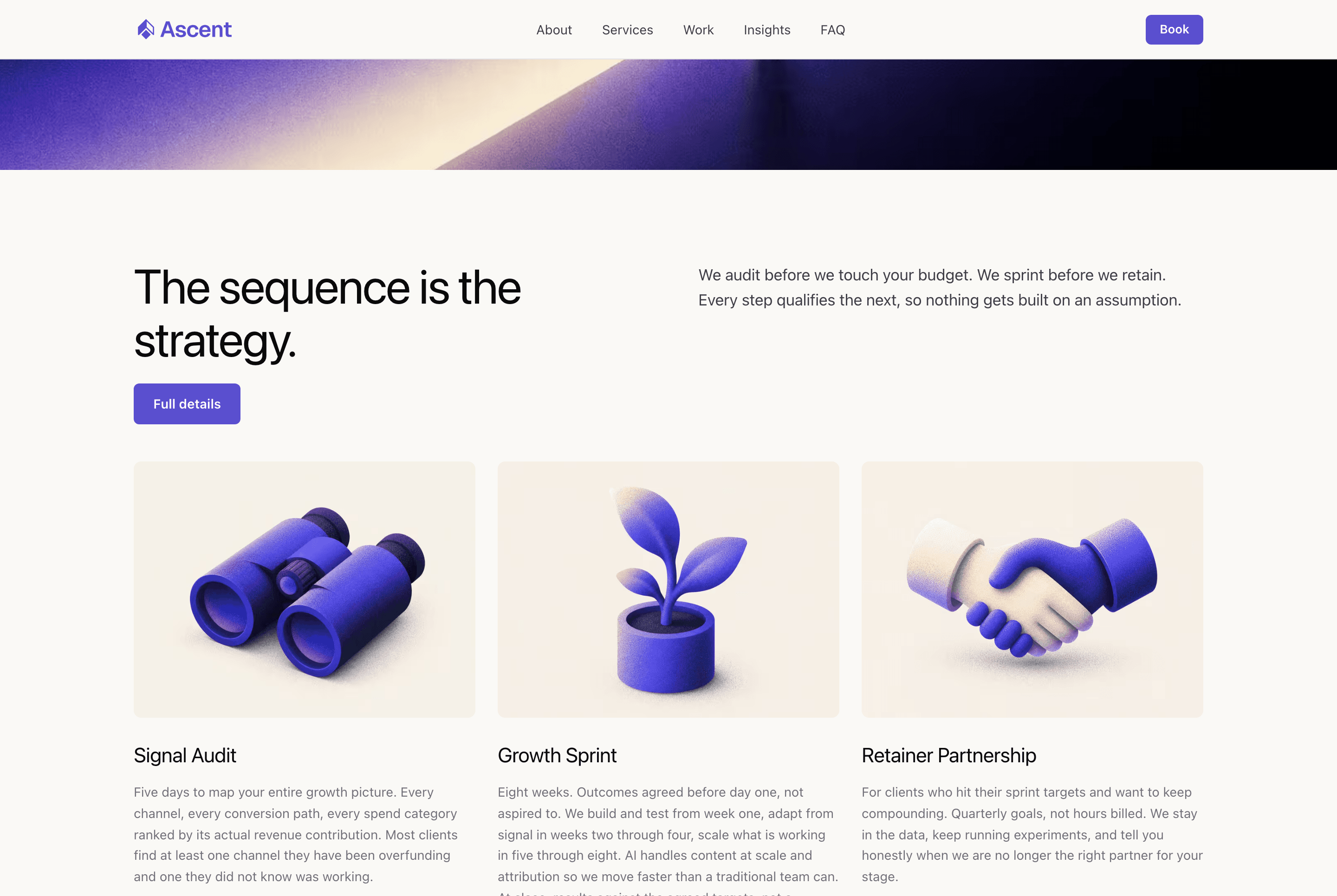
5. Build your brand identity
Keep this lightweight. You need a logo, a primary colour, and a font. That's enough to move forward.
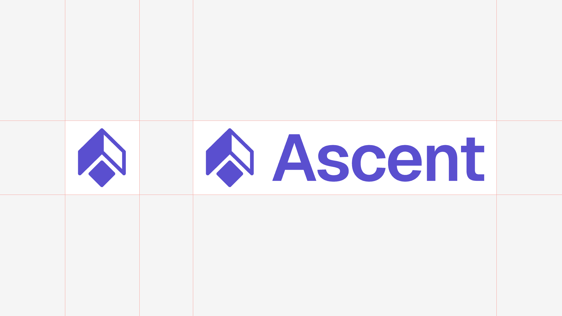
Logo
I used Nano Banana to generate starting points. Fill in the brackets and run the prompt below several times. You're not looking for a final logo, you're looking for a direction. One image out of twenty will have the right energy.
Generate a logo for [describe your business type] "[Your Business Name]".
[Symbol style: geometric shape symbol + wordmark / lettermark / wordmark only].
White background. [Style: super minimal / bold / editorial].
Flat not 3D. [Symbol type: abstract / literal / typographic].
From there I brought the chosen direction into Figma, recreated the symbol as a vector, and paired it with the right font to complete the wordmark. If you want to skip the manual recreation,
Quiver will vectorise an image directly.
With the symbol locked, I applied the brand colour and finalised the lockup.
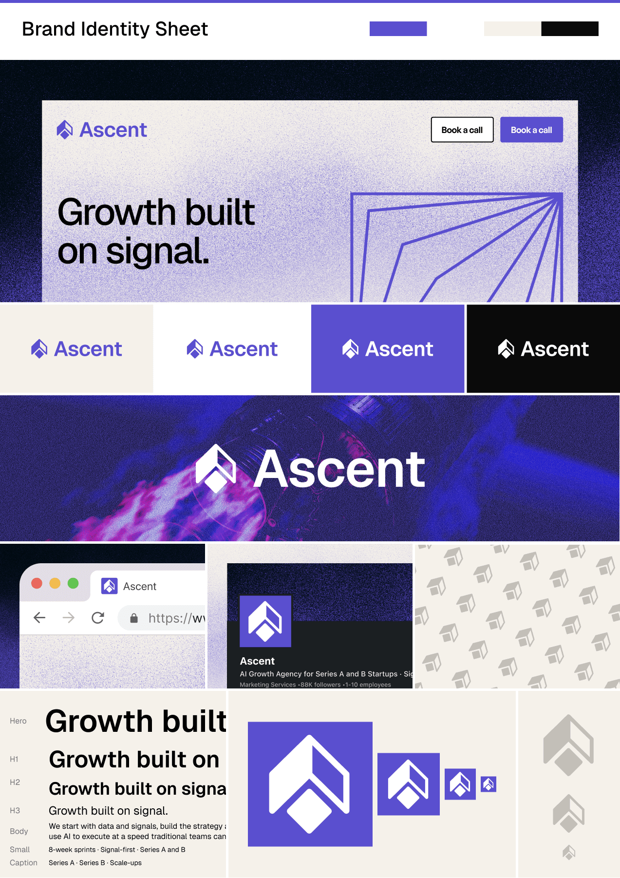
Brand sheet
Before committing anything to code, I built a quick brand sheet in Figma. Logo on different backgrounds, at different sizes, with the colour and type applied. This is the moment to catch whether the brand holds up across contexts, and it's also where I locked in a grainy gradient treatment for hero sections and accents. It adds texture without complexity, and it photographs well as a screenshot.
Exports
Before moving on, export everything you need from Figma. You won't want to come back for these mid-build.
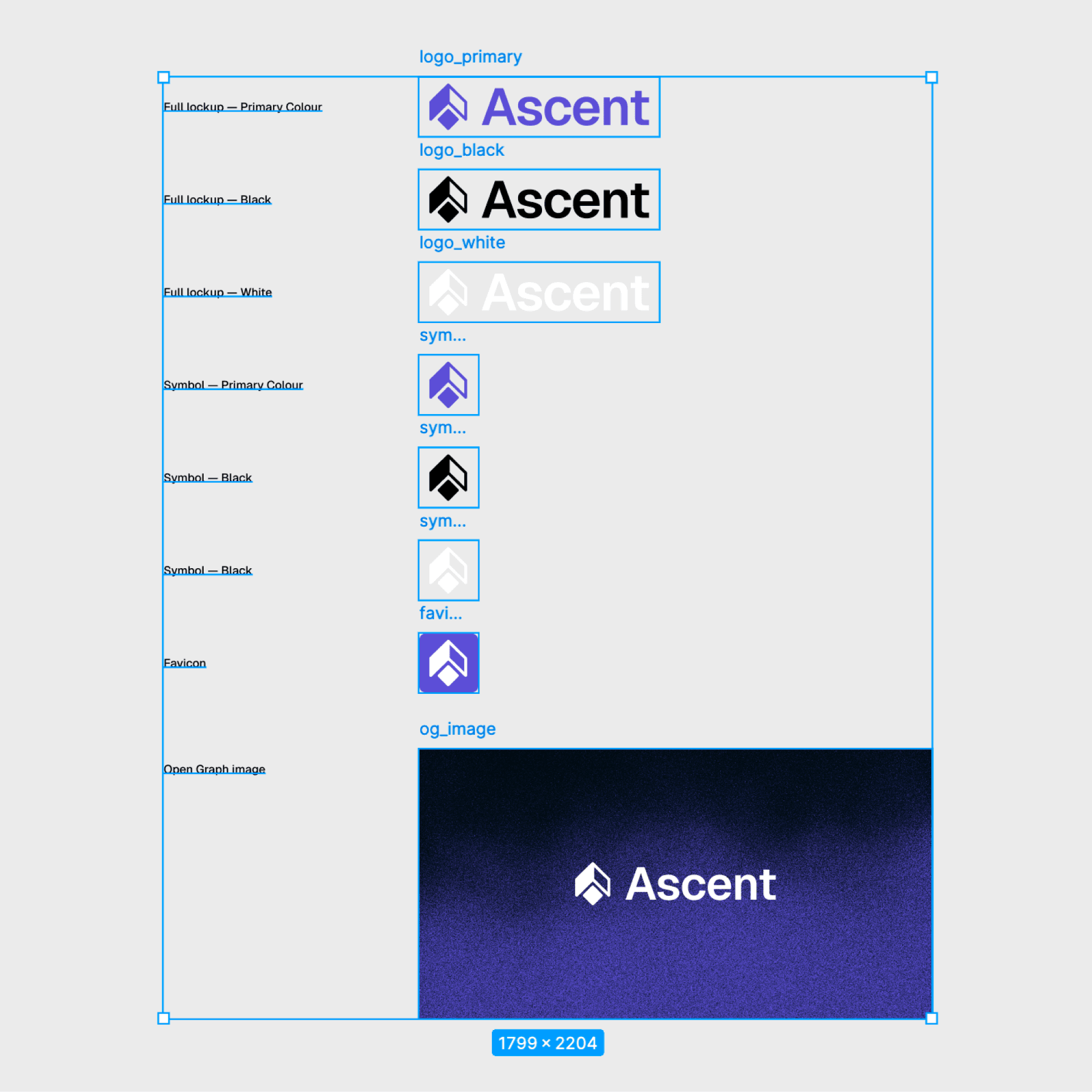
Logo variations, each in SVG and PNG (transparent background):
- Full lockup, primary colour: primary version, used on white and light backgrounds across the site
- Full lockup, black: for contexts where colour doesn't work: documents, print, monochrome placements
- Full lockup, white: for dark and primary-coloured backgrounds, the hero gradient, dark sections
- Symbol only, primary colour: profile pictures, favicons, app icons, anywhere the wordmark is too wide to fit
- Symbol only, black: small monochrome placements, watermarks, co-branding
- Symbol only, white: same as above but on dark or coloured backgrounds
Favicon: SVG at 32x32 (scales perfectly across all modern browsers, no resolution loss)
OG image: 1200x630px. OG stands for Open Graph, and it controls how your link looks when shared. Every time someone pastes your URL into LinkedIn, X, or Slack, this image renders as the preview card. Without it platforms grab a random image from the page or show nothing. Use the logo on the brand gradient so every share is a branded impression.
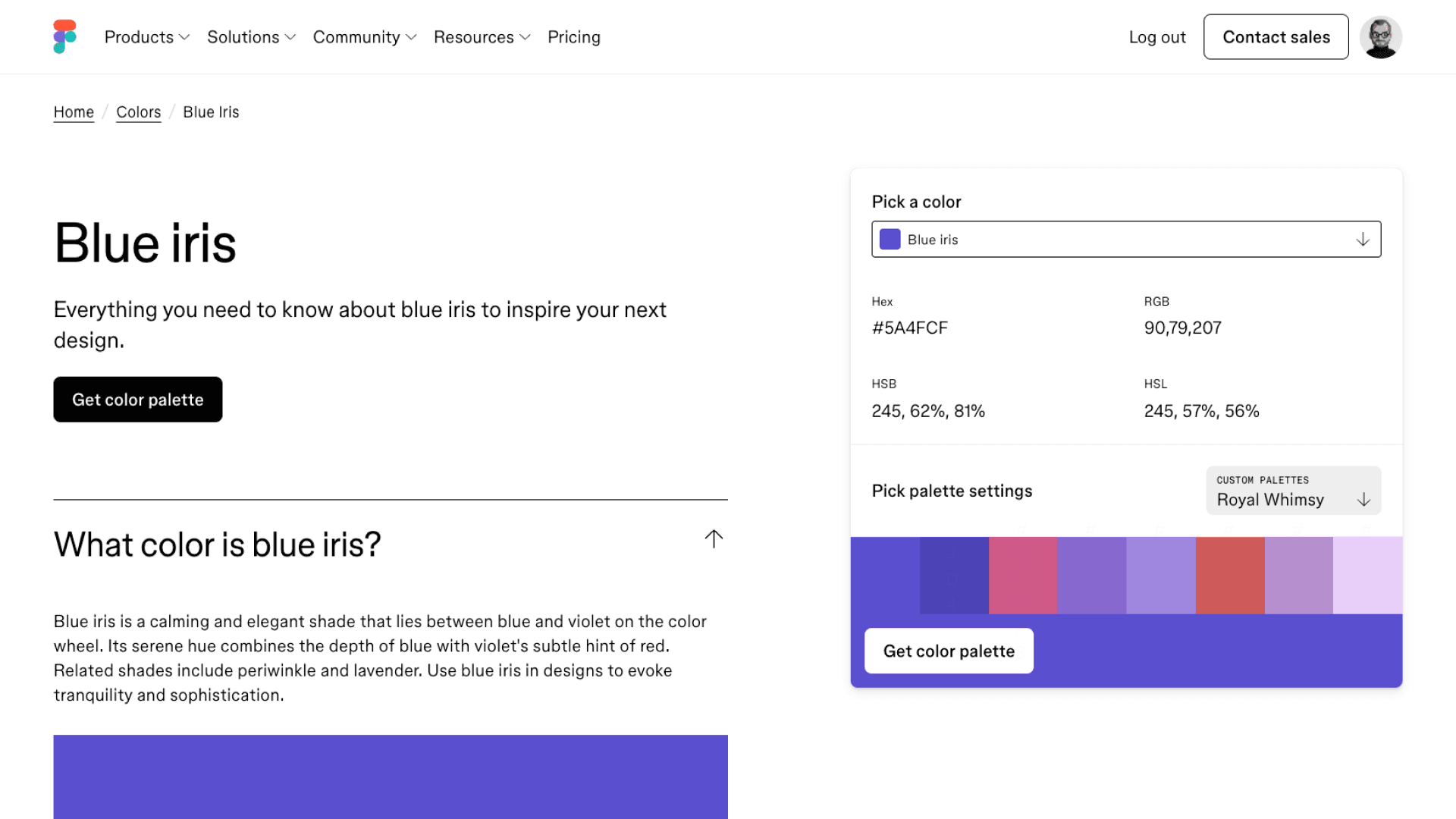
Colours
I found the primary, Blue Iris #5A4FCF, at figma.com/colors/blue-iris. The rest of the palette gets derived from it in the DESIGN.md step.
Typography
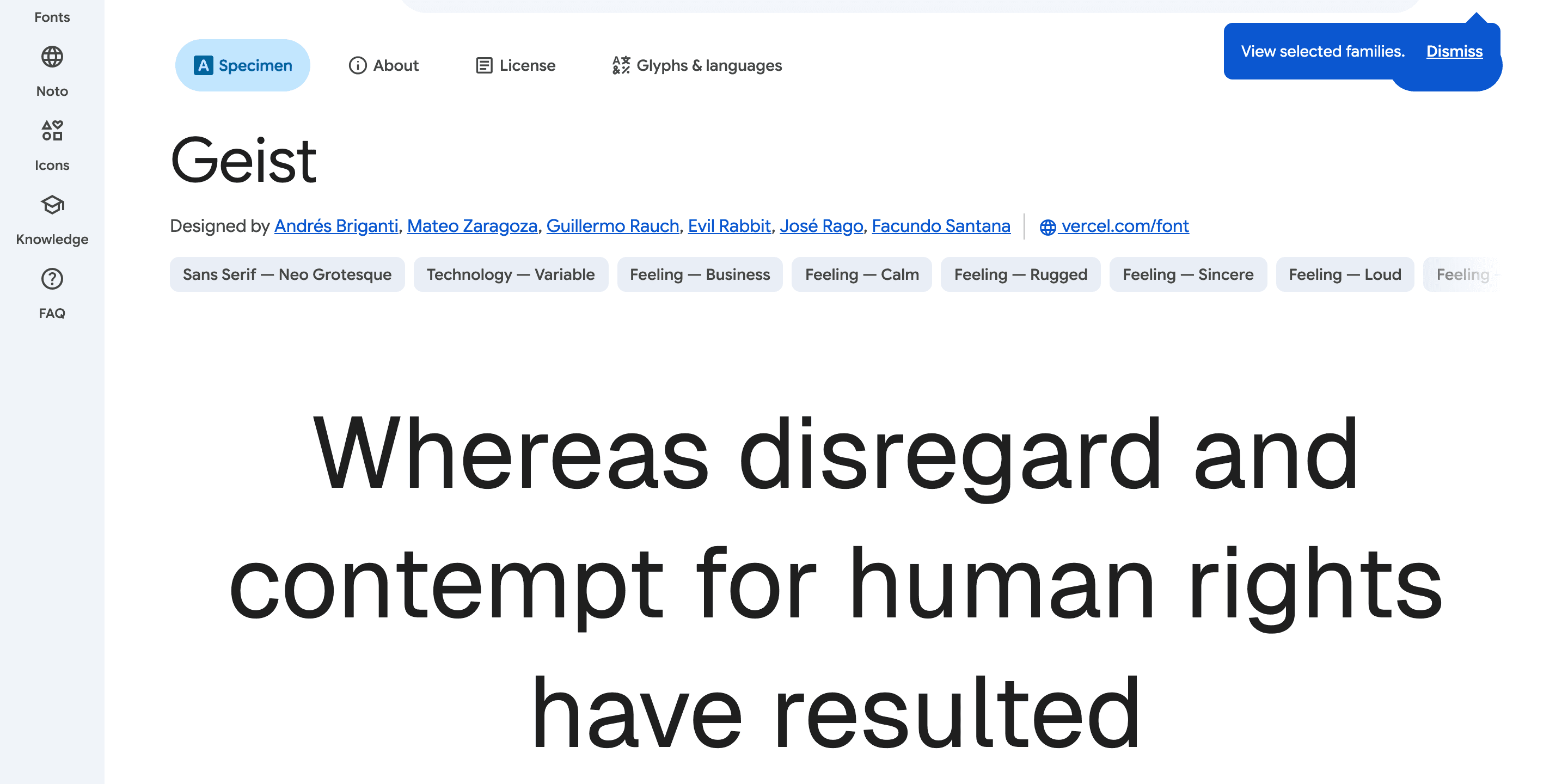
Geist Sans from Google Fonts. Built for screens and holds up at caption size and at hero size.
6. Create your DESIGN.md
This file keeps your design consistent across every prompt, every session, every component. It's the visual equivalent of your BRIEF.md.
You only need three inputs to generate it. The AI derives everything else.
You are a brand system designer. Generate a complete DESIGN.md from these inputs:

Primary colour: [paste your hex]
Font: [font name, specify heading and body separately if different]
Theme: [light or dark]

Generate all of the following:

1. Visual Theme: 1 paragraph describing the brand atmosphere, 6 to 8 characteristic
   bullet points
2. Colour Palette: derive 10 to 12 named tokens. Primary, primary hover, background,
   surface, border, heading text, body text, secondary text, muted/disabled, success,
   warning, error. Include exact hex values and the role of each.
3. Typography: a full hierarchy table with columns: role, size (px), weight,
   line-height, letter-spacing. Cover at minimum: hero, h1, h2, h3, body,
   small, caption, button, code.
4. Components: button variants (primary, secondary, ghost, disabled), card,
   input/form field, navigation. Include hover and focus states.
5. Layout: spacing scale (base 8px), max container widths, border radius scale
   (at minimum buttons, inputs, cards, modals, all button variants using
   the same radius value), whitespace philosophy.
6. Shadows: 3 elevation levels (flat, card, modal) with exact rgba box-shadow
   values. Adjust for theme.
7. Do's and Don'ts: 6 to 8 rules each, specific and actionable.
8. Responsive Behaviour: breakpoints table (mobile, tablet, desktop, large),
   touch target minimums, collapsing strategy for nav and key components.
9. Agent Prompt Guide: a colour cheat-sheet and 4 copy-paste component prompts
   using the actual tokens from this file.

Output the complete DESIGN.md only. No explanation, no preamble.
# DESIGN.md, [Business Name]

## 1. Visual Theme & Atmosphere

[One paragraph describing the brand atmosphere. Then 6 to 8 bullet points
naming specific visual characteristics: contrast approach, colour usage,
typographic style, whitespace philosophy, what is absent.]

## 2. Colour Palette & Roles

| Token | Hex | Role |
|---|---|---|
| Primary | [hex] | [usage] |
| Primary Hover | [hex] | [usage] |
| Primary Subtle | [hex] | [usage] |
| Background | [hex] | [usage] |
| Surface | [hex] | [usage] |
| Border | [hex] | [usage] |
| Heading Text | [hex] | [usage] |
| Body Text | [hex] | [usage] |
| Secondary Text | [hex] | [usage] |
| Muted / Disabled | [hex] | [usage] |
| Success | [hex] | [usage] |
| Warning | [hex] | [usage] |
| Error | [hex] | [usage] |

## 3. Typography: [Font Name]

[Font stack and fallback.]

| Role | Size (px) | Weight | Line Height | Letter Spacing |
|---|---|---|---|---|
| Hero | | | | |
| H1 | | | | |
| H2 | | | | |
| H3 | | | | |
| H4 | | | | |
| Body | | | | |
| Small | | | | |
| Caption | | | | |
| Button | | | | |
| Code | | | | |

[2 to 3 typography principles specific to this system.]

## 4. Component Stylings

### Buttons
[Primary, secondary, and ghost variants. Each with: background, color,
border-radius, padding, font. Plus hover, focus, and disabled states.
All variants share the same border-radius value.]

### Cards
[Background, border, border-radius, padding, shadow. Plus hover state.]

### Input / Form Field
[Background, border, border-radius, padding, font, color. Plus focus,
error, disabled, and placeholder states.]

### Navigation
[Background, border, height, padding. Logo, link, and active link styles.
CTA button spec. Mobile collapse breakpoint.]

## 5. Layout Principles

Spacing scale (base 8px): [list values]

Container widths:
- Default: [max-width], [side padding]
- Narrow: [max-width]
- Wide: [strategy]

Border radius:
- Inputs, buttons: [value]
- Cards, panels: [value]
- Modals: [value]
- Pills, avatars: 9999px

[One or two whitespace principles.]

## 6. Depth & Elevation

| Level | Use | Box Shadow |
|---|---|---|
| Flat | | none |
| Card | | [shadow] |
| Raised | | [shadow] |
| Modal | | [shadow] |

## 7. Do's and Don'ts

Do:
- [6 to 8 specific, actionable rules]

Don't:
- [6 to 8 specific, actionable rules]

## 8. Responsive Behaviour

Breakpoints:
- Mobile: 0 to 639px
- Tablet: 640 to 1023px
- Desktop: 1024 to 1279px
- Large: 1280px and above

Touch targets: minimum 44x44px. Buttons minimum 48px height on mobile.

| Component | Mobile | Tablet | Desktop |
|---|---|---|---|
| Navigation | | | |
| Card grids | | | |
| Hero text | | | |
| Two-column sections | | | |
| Container padding | | | |

## 9. Agent Prompt Guide

[Colour cheat-sheet as a single line.]

[4 copy-paste component prompts using the actual tokens from this file:
hero section, feature card grid, lead capture section, navigation bar.]
# DESIGN.md, Ascent

## 1. Visual Theme & Atmosphere

Ascent is precise, confident, and unhurried. The visual language is clean and
direct: generous whitespace, a sharp typographic hierarchy, and a single strong
primary colour used with restraint. Nothing decorative earns its place unless
it carries meaning.

Key characteristics:
- High contrast between heading and body text creates a clear reading hierarchy
- Primary colour (#5A4FCF) appears sparingly: CTAs, active states, key data points only
- Warm off-white background softens the otherwise minimal palette
- Geist Sans at varying weights does most of the visual work
- Ample negative space signals confidence, not emptiness
- Interactive elements are immediately legible without relying on colour alone
- No decorative gradients, illustrations, or background textures

## 2. Colour Palette & Roles

| Token | Hex | Role |
|---|---|---|
| Primary | #5A4FCF | CTAs, active nav, key interactive elements |
| Primary Hover | #4840B8 | Hover state for primary buttons and links |
| Primary Subtle | #EAE8FA | Backgrounds behind primary-coloured text, badges |
| Background | #FAF9F6 | Page background, warm off-white |
| Surface | #F5F1EA | Cards, sidebar panels, grouped content |
| Border | #E4E4E7 | Dividers, input borders, card outlines |
| Heading Text | #0A0A0A | H1 through H3, strong emphasis |
| Body Text | #3F3F46 | Paragraphs, descriptions, general copy |
| Secondary Text | #71717A | Labels, meta, timestamps, supporting copy |
| Muted / Disabled | #A1A1AA | Disabled states, placeholder text, captions |
| Success | #16A34A | Confirmations, completed states |
| Warning | #D97706 | Alerts, non-critical notices |
| Error | #DC2626 | Validation errors, destructive actions |

## 3. Typography: Geist Sans

| Role | Size (px) | Weight | Line Height | Letter Spacing |
|---|---|---|---|---|
| Hero | 64 | 700 | 1.05 | -0.03em |
| H1 | 48 | 700 | 1.10 | -0.02em |
| H2 | 36 | 700 | 1.15 | -0.02em |
| H3 | 24 | 600 | 1.30 | -0.01em |
| H4 | 20 | 600 | 1.35 | -0.01em |
| Body | 16 | 400 | 1.60 | 0 |
| Small | 14 | 400 | 1.50 | 0 |
| Caption | 12 | 400 | 1.40 | 0.01em |
| Button | 14 | 600 | 1.00 | 0.01em |
| Code | 13 | 400 | 1.60 | 0 |

## 4. Component Stylings

Buttons. Primary: background #5A4FCF, color #FFFFFF, radius 4px, padding 10px 20px,
Geist 600 14px. Hover #4840B8. Focus: outline 2px solid #5A4FCF offset 2px.

Cards. background #FFFFFF, border 1px solid #E4E4E7, radius 6px, padding 24px,
shadow 0 1px 3px rgba(0,0,0,0.06), 0 2px 8px rgba(0,0,0,0.04). Hover raises shadow.

Input. background #FFFFFF, border 1.5px solid #E4E4E7, radius 4px, padding 10px 14px.
Focus border #5A4FCF. Error border #DC2626. Placeholder #A1A1AA.

Navigation. background #FAF9F6, border-bottom 1px #E4E4E7, height 64px, padding 0 24px.
Mobile: hamburger at < 1024px.

## 5. Layout Principles

Spacing scale (base 8px): 4 / 8 / 12 / 16 / 24 / 32 / 48 / 64 / 96 / 128px

Container widths:
- Default: 1200px max, 24px side padding
- Narrow (articles, forms): 720px max
- Wide (full-bleed sections): 100%, 48px side padding

(Plus sections 6 through 9: elevation, do's and don'ts, responsive behaviour,
and an agent prompt guide containing the colour cheat-sheet and four
copy-paste component prompts.)
Save it as DESIGN.md at the root of your repository.
7. Set up the app
I default to Next.js with
Tailwind CSS. It's the most common stack for this type of project and
Claude Code handles it well. If you want pre-built components you don't have to build from scratch,
Shadcn/ui is a solid option to layer on top. For this build we're going without it. Everything gets built from the design system in
DESIGN.md directly.
For icons I use Phosphor Icons. It's free, covers everything you'll need, and the React package installs in one line.
This step is the technical scaffold only: framework, language, package manager, base tooling. Brand, copy, and CTAs come later in the build prompt.
Set up a new Next.js 15 app with the App Router and Tailwind CSS.

Requirements:
- TypeScript
- Mobile-first responsive layout
- Set up a base layout with an empty navigation bar and footer
- The nav should collapse to a hamburger menu on mobile
- Add a cookie consent banner component (required for GDPR compliance for EU and UK visitors)
- Install Phosphor Icons (phosphor-icons/react) for all iconography
One rule before you go further: don't let Claude Code generate your visuals inline during the build. Mark image slots as placeholders and come back in step 9. Visuals need iteration and dedicated tools. Claude Code isn't the right place for that, and anything it generates without direction will look like every other AI site. Step 9 is where you fix this properly.
Before writing your first component prompt, install a few Claude Code skills. Skills are reusable instruction sets that load into Claude's context automatically, keeping outputs consistent without you having to repeat yourself. Find the full directory at skills.sh.
A few worth considering, regardless of stack or scope:
find-skills (vercel-labs/skills): search and install skills from inside Claude, useful when you know what you need but not what it's called
Pick what's useful, skip what isn't. Step 8's build prompt references a few more that are specific to a Next.js build.
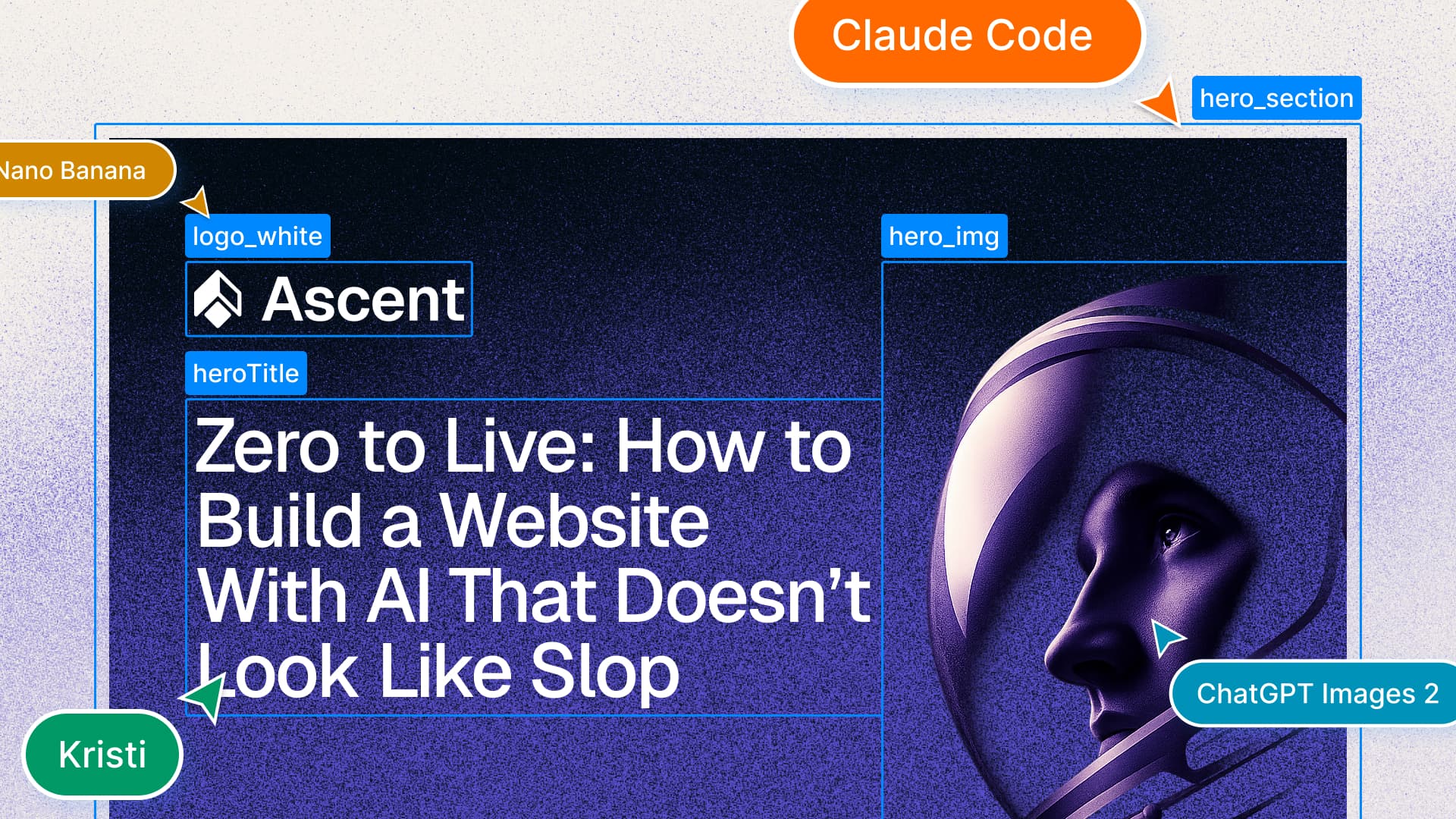
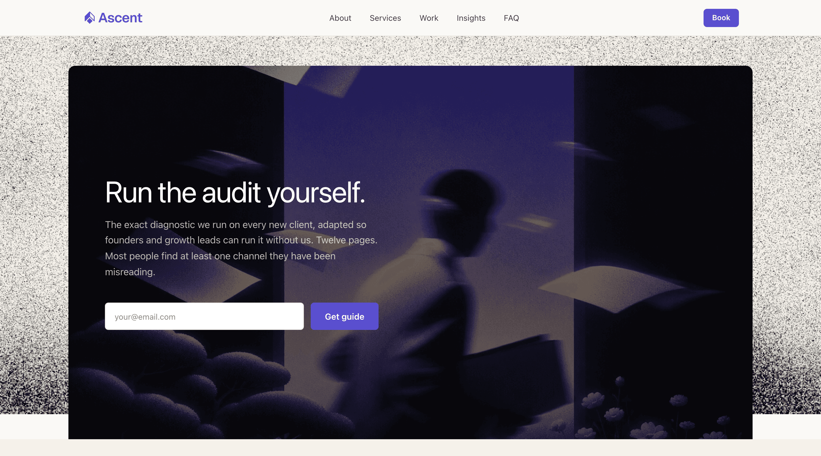
8. Build the site
Build everything in one pass. Run this prompt with the homepage first so it becomes your visual reference, then extend to all supporting pages. Imagery comes next. Leave placeholder containers where assets are not ready and you'll fill them in step 9.
Build the full website using the brief in BRIEF.md and the design system
in DESIGN.md.

Skills
Install these before running this prompt (skills.sh):
- frontend-design (anthropics/skills): production-grade UI, rejects generic AI patterns
- vercel-react-best-practices (vercel-labs/agent-skills): 70 React/Next.js performance rules
- next-best-practices (vercel-labs/next-skills): Next.js 15. RSC, async, hydration, optimisation
- web-design-guidelines (vercel-labs/agent-skills): design consistency and accessibility audit
- shadcn (shadcn/ui): keeps Claude aligned with how Shadcn/ui is meant to be used
- skill-creator (anthropics/skills): when you need a skill that doesn't exist yet, this builds it

Pages to build (edit this list to match your business):
- Homepage
- About
- Services
- Case Studies
- Pricing
- Book
- FAQ
- Contact

CTAs (pull these straight from BRIEF.md):
- Primary throughout: Book
- Secondary throughout: Our Work
- Lead magnet: The Audit

Layout
Do not apply a generic website template. Each page has a different purpose
and should be structured to serve it. A homepage qualifies and converts. An
about page builds trust. A services page answers "can you do what I need".
Let the content and purpose of each page drive its layout. Vary section
patterns across the site.

Copy
Write full, considered copy for every section on every page. No placeholder
text. Every headline, subheadline, body paragraph, and CTA must be specific,
on-brand, and grounded in BRIEF.md.

- Headlines make a claim. They do not announce a topic.
- Body copy is direct: one idea per paragraph, no filler sentences.
- CTAs describe the action ("Book a 30-minute call", not "Get in touch").
- If BRIEF.md does not contain enough to write a section, make the best
  inference and mark it [REVIEW] for sign-off.

Standards
Every page includes the global navigation and footer. Every page ends with
a closing CTA section tied to the primary conversion from BRIEF.md. Apply
the colour palette, typography, spacing scale, and component styles from
DESIGN.md throughout.

What to avoid
- Three-card grids as the default layout for every feature or benefit
- Generic headlines: "Built for growth", "Trusted by teams worldwide",
  "Your success is our mission", "Transforming the way you work"
- Decorative gradient blobs or floating shapes unless DESIGN.md specifies them
- Testimonial carousels on every page
- "Why Choose Us" as a section header: show the answer, do not label it
- Centre-aligned text on every section: reserve it for hero and CTA blocks
- Scroll-triggered animations on every element
- Icon plus title plus one-line description as the only content pattern
- Any layout or copy that would look equally at home on any other website

Visuals
Do not generate or invent visuals. Use placeholder containers wherever
images, video, or illustrations would go, and mark them [IMAGE NEEDED]
so they are easy to find. Real visuals are sourced in step 9 and slotted
in afterwards.9. Source your imagery
This is the step most people skip, and it shows. A well-built site with generic or absent imagery still looks like a template, because the visuals are what make a website feel alive. They add context, create atmosphere, and give visitors something to feel rather than just read. Think about what each key section actually needs. The hero sets the tone, service sections need imagery to avoid reading like a document, and case studies with real screenshots become evidence rather than claims.
If you don't know where to start, get inspiration first. Pinterest is the fastest way to build a visual brief. Search for the mood and the colour direction, and pin twenty things until a pattern emerges. For website UI specifically,
Variant is a gallery of real product sites worth browsing for layout and interaction ideas.
Two tools handle the actual generation. GPT Image 2 and
Nano Banana both let you describe what you need and iterate from there. I've found GPT Image 2 the more useful of the two. Prompt adherence is sharper, the iterations stay closer to the original direction, and the output handles brand-specific texture and atmosphere better. Nano Banana is fast and good for generating starting points, especially when you're still exploring a direction.
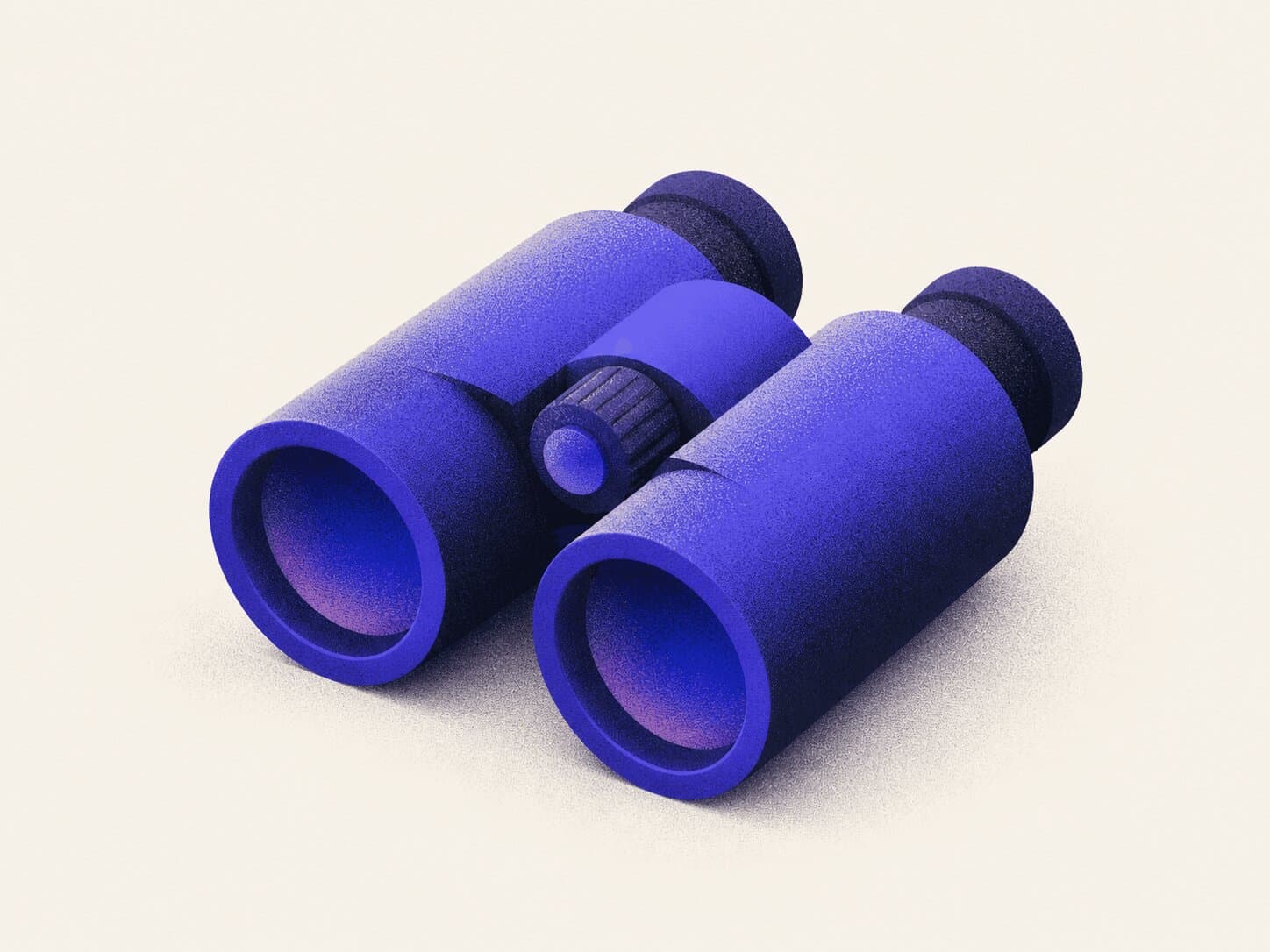
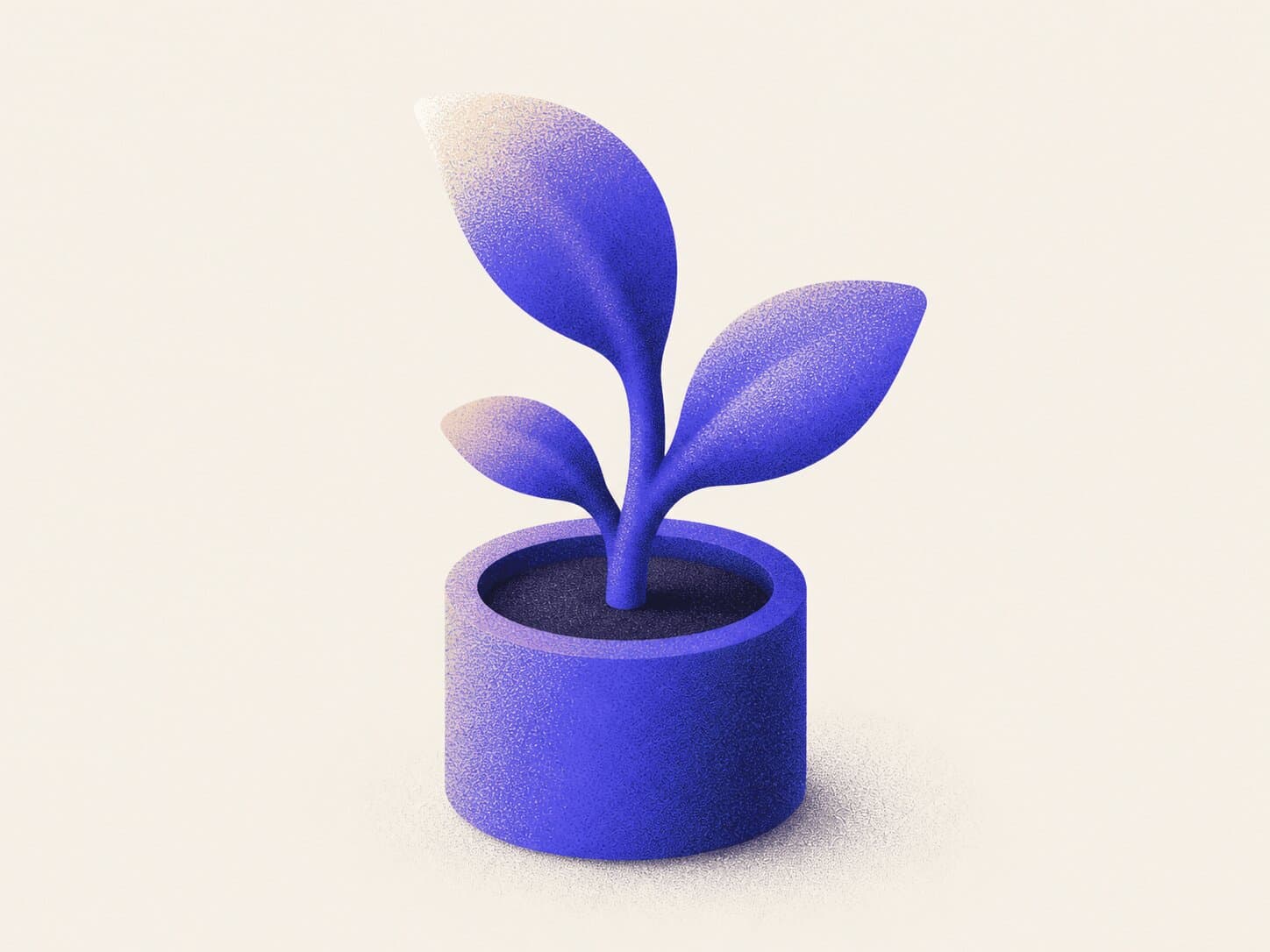
For Ascent that meant aerial textures and atmospheric gradients that fit the brand's aviation-and-altitude direction, plus a set of stylised illustrations for the services, rather than generic "growth" imagery. A few pieces from the final visual library:


Once the visuals are ready, replace every [IMAGE NEEDED] placeholder from step 8 with the real asset. The layout was built around their dimensions; slotting them in is a fast pass.
10. Test and refine
The AI gets you most of the way. The last 20% is yours.
Don't fix issues one by one as you spot them. Do a full review pass first, note everything, then batch fixes by type: spacing together, typography together, mobile together. It's faster and far less likely to introduce regressions.
What to check on each page:
- Layout consistency with DESIGN.md: spacing, colours, typography
- Mobile at 320px, 375px, and 390px, not just the browser's responsive toggle
- All interactive elements: buttons, links, hover states, focus states
- Typography scale across breakpoints
- Keyboard navigation: tab through every interactive element on every page
A few things AI consistently gets wrong that you'll need to catch manually: hover and focus states, line height on large headings at small screen sizes, and anything involving icons or custom illustrations.
Test on an actual phone, not just the browser's responsive view. They behave differently.
If you installed the audit-website skill, run it here. It sweeps 230+ rules across SEO, accessibility, security, and performance and returns a prioritised fix list.
11. Deploy
I use Vercel. The integration with Next.js is tight and deployment takes about five minutes once your repo is set up.
If you connected Vercel as a connected app in Claude Code (back in the prerequisites), you can trigger a deploy directly from Claude. The prompt below handles it. If you skipped that step, the manual route works fine too.
Deploy to Vercel using the deploy-to-vercel skill (vercel-labs/agent-skills).
It detects whether your project is linked, chooses the right deployment method,
and returns a preview URL. If not installed:
npx skills add https://github.com/vercel-labs/agent-skills --skill deploy-to-vercel

Or run manually:
vercel --prod
Or just push to main and Vercel deploys automatically if you've connected the repo.
To connect your domain: go to Project Settings > Domains, add your domain, and Vercel will give you the DNS records to add at your registrar. If you bought the domain through Vercel this happens automatically. For external registrars it takes up to 48 hours to propagate, usually much faster.
Once live, check the production URL on mobile and desktop. Run it through PageSpeed Insights to catch any performance issues before you send it to anyone.
That's it. You now have a live site, a real domain, and a codebase you can keep building on.
The final result
Ascent is live at ![]() ascent-up.vercel.app. Full source on
ascent-up.vercel.app. Full source on GitHub.

To wrap up
The AI does the heavy lifting. Give it a brief, a brand, and a design system, and it'll build most of the site and write most of the copy. That part is genuinely fast.
What makes the difference is the decisions you made before you opened a tool, and the ones you make after. The image prompts you iterated on until the result actually fit the brand, the copy you rewrote because the AI's first version was technically fine but felt flat. You can use AI for all of it, but someone still has to have the taste to direct it.
Claude Code is only as good as the context you give it. That's what every step in this guide is doing: building context before the build starts, so the brief, the design system, and the imagery work narrow what the AI is allowed to assume. By the time you run the build prompt, the AI is executing decisions you already made, not inventing them.
That's why people who open Claude Code and start prompting immediately end up correcting so much, because they handed the decisions to the AI before they'd made them themselves.


